
data muse
Big Data Analysis & Visualisation
We can offer consultation on how best to analyse and present your data - below are some of the analyses and visualisations our team members have produced
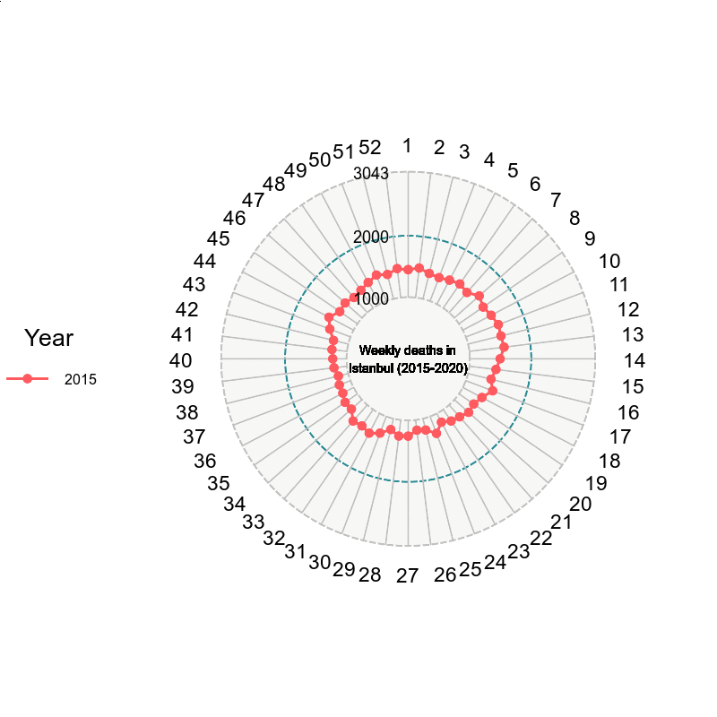
Weekly Excess Deaths in Istanbul during the COVID-19 pandemic
Static & dynamic figures displaying weekly excess deaths in Istanbul (2020 compared to 2015-19 averages) – which was picked up by social media users and prominent science media/journals worldwide (e.g. BBC World) and in Turkey (e.g. Sarkaç, Cumhuriyet, T24)


Genome-wide Association Study of Lung Function
A ‘Circos’ plot showing the results of a Genome-wide association study of lung function – this figure displays the key results of a study published in the prestigious journal Nature Genetics. Results are displayed clockwise from chromosome 1 to 22. The peaks in red are newly discovered genetic regions, and the blue ones were previously identified by other groups. Millions of genetic variants from tens of thousands of individuals were analysed in this study.

Nature Index Rankings of the Top 50 Countries
Figure showing the ‘Nature Index’ rankings of the top 50 countries – to do this we accessed the right data and used R programming to visualise the results in an informative but also aesthetic way

Number of Citations and h-index
Figure showing the number of citations and h-index of Dr Mesut Erzurumluoglu (our co-founder) – who proposed that a similar version of this figure be inserted in the CVs of many postdocs who were looking for a job and requested a review of their CVs. We are pleased to say most of the postdocs found a job. We also reviewed the CV and personal statements of prospective PhD students for free.

Number of Papers Published by Turkish State Universities on a Map of Turkey
Figure showing the number of papers published by Turkish state universities on a map of Turkey – an efficient way to visualise a large table (blue: highest category; red: lowest).

